📊 AP Statistics Score Calculator: A Visual Guide
Navigating the world of statistics can feel complex, but having the right tools makes all the difference. The AP Statistics Score Calculator is designed to simplify this process, providing a clean, intuitive interface for students and professionals alike. This guide will walk you through every visual element of this powerful tool, explaining how to use each section to get the answers you need quickly and efficiently. Forget complex formulas and backend code; we are focusing entirely on the user experience and how this calculator presents information in an easy-to-understand format. Whether you're a student preparing for an exam or a researcher analyzing data, this AP Statistics Score Calculator is your go-to resource.
A First Look: The Header and Main Interface
The moment you land on the AP Statistics Score Calculator page, you're greeted by a clean, modern, and visually engaging header. The design philosophy is clear: simplicity and functionality.
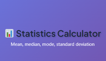
At the very top, the title, “📊 AP Statistics Score Calculator,” stands out with a friendly emoji that immediately signals the tool's purpose. The font is bold and easy to read, set against a vibrant gradient background that shifts from a cool blue to a subtle purple. This isn't just a boring utility; it's a well-designed application meant to make your work more enjoyable.
Directly beneath the title, a concise subtitle explains exactly what the tool does: "Your all-in-one calculator for descriptive statistics, probability, regression, and distributions." This simple sentence sets your expectations, letting you know the full scope of the calculator's capabilities right from the start.
The layout is uncluttered, with ample white space that guides your eyes naturally toward the main functional areas of the tool. You won't find yourself hunting for features or getting lost in a maze of buttons. Everything you need from this powerful AP Statistics Score Calculator is organized logically into distinct tabs.
Exploring the Core Features: A Tab-by-Tab Walkthrough
The main power of the AP Statistics Score Calculator is neatly organized into four primary tabs: Descriptive Statistics, Probability, Regression, and Distribution. Each tab represents a different area of statistical analysis, with its own specialized inputs and outputs. Let's dive into the visual and functional design of each one.
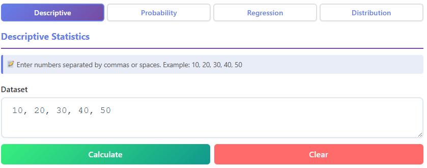
The Descriptive Statistics Tab
This is often the first stop for anyone working with a new set of data. This tab is designed to give you a comprehensive summary of your dataset with just a few clicks.
Input Area:
The primary feature you'll notice is a large, welcoming text box labeled "Enter your dataset here." This input area is designed to be flexible. You can paste a list of numbers separated by commas, spaces, or even new lines. To help you get started, a helpful placeholder text shows an example: "e.g., 5, 8, 12, 15, 22". This simple cue ensures you know exactly how to format your data without needing to consult a help file.
The generous size of the text area signals that it can handle both small and large datasets with ease. For students familiar with other tools, like an ap lang score calculator, this focus on clear inputs and immediate results will feel refreshingly straightforward.
Buttons:
Below the input area, two distinct buttons control the action. The "Calculate" button is the star of the show. It has a bright, solid color that draws your attention and even has a subtle hover effect—it might lighten slightly or show a soft shadow when you move your mouse over it.
This provides interactive feedback, letting you know the button is ready for your command. Next to it is the "Clear" button. Visually, it's less prominent, perhaps outlined or in a more muted color. When you click it, the input box and any previous results instantly vanish, giving you a clean slate. This is a crucial feature of a good AP Statistics Score Calculator.
Results Section:
Once you hit "Calculate," the magic happens. Below the buttons, a results section appears, displaying a grid of key statistical metrics. Each metric is presented on its own "card" or in a neat row, with the label clearly stated (e.g., "Mean," "Median," "Mode") and the calculated value displayed in a large, bold font. This design makes the outputs incredibly scannable. The key values you'll see include:
- Mean: The average of your data.
- Median: The middle value of the sorted dataset.
- Mode: The most frequently occurring number.
- Standard Deviation: A measure of data spread.
- Variance: The square of the standard deviation.
- Count: The total number of data points you entered.
- Sum: The total of all values.
- Range: The difference between the max and min values.
- Min/Max: The smallest and largest values in your set.
- Quartiles (Q1, Q3): The values that divide your data into quarters.
This comprehensive output makes the AP Statistics Score Calculator an invaluable tool for initial data exploration.
The Probability Tab

Switching gears to the "Probability" tab, the interface changes to accommodate calculations for permutations and combinations. The design remains clean and user-focused.
Input Fields:
Instead of a large text area, you'll find two clean input fields labeled "Total number of items (n)" and "Number of items to choose (r)." These fields are clearly defined boxes, sized perfectly for numerical input. Like the previous tab, they contain helpful placeholder text (e.g., "Enter n" and "Enter r") to guide you. The focused nature of these inputs makes this section of the AP Statistics Score Calculator very efficient for specific probability problems. It’s as intuitive to use as an ap csp score calculator might be for a computer science problem, requiring only the essential variables to deliver a result.
Buttons:
The buttons here are tailored to the task. You'll see "Permutation (P)" and "Combination (C)" buttons, each designed to trigger a specific calculation. They share the same responsive design as the "Calculate" button, with satisfying visual feedback on hover and click. A "Clear" button is also present to reset the 'n' and 'r' fields instantly.
Results Section:
Upon clicking either the "Permutation (P)" or "Combination (C)" button, the results are displayed on visually distinct "result cards." These cards might have a subtle background color or a border to separate them from the rest of the interface. The key results displayed are:
- Permutation: The total number of ways to arrange 'r' items from 'n'.
- Combination: The number of ways to choose 'r' items from 'n', where order doesn't matter.
- Factorial: The factorials for n! and r! are often shown for reference.
- Ratio: Sometimes, the ratio of permutation to combination is displayed.
The most important result (the one you requested) is highlighted with a larger font or a brighter color, making it impossible to miss. This design choice in the AP Statistics Score Calculator ensures you find your answer at a glance.
The Regression Tab
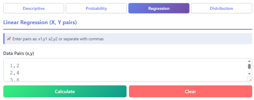
The "Regression" tab is your destination for exploring the relationship between two variables. It's designed to help you perform linear regression analysis effortlessly.
Input Area:
This tab features a specialized input area for paired data. You'll see a text box labeled "Enter your data pairs (x,y)." An example format, like "(1,2), (2,4), (3,5)", is provided as a placeholder. This guides the user to enter their data in a structured way, ensuring the calculator can correctly parse the x and y values for each point. The interface is built for clarity, a principle that would be valued in any analytical tool, including a hypothetical ap gov score calculator used for analyzing polling data. This feature of the AP Statistics Score Calculator is perfect for finding trends.
Buttons:
Similar to the other tabs, you have a primary "Calculate" button and a "Clear" button. Their consistent design and placement across the tool create a predictable and comfortable user experience. You always know where to look to perform an action or to reset your workspace. This consistency is a hallmark of a well-thought-out AP Statistics Score Calculator.
Results Section:
The output in the Regression tab is particularly insightful. After calculating, you are presented with:
- Linear Equation: The equation of the best-fit line (e.g., y = 2.1x + 0.5) is displayed prominently.
- Slope (b): The value for the slope of the line.
- Y-Intercept (a): The point where the line crosses the y-axis.
- Correlation Coefficient (r): A value between -1 and 1 that measures the strength and direction of the linear relationship. This value is often color-coded—green for positive, red for negative—to give you an immediate visual cue.
- R-Squared (R²): The coefficient of determination, which tells you the proportion of the variance in the dependent variable that is predictable from the independent variable.
This visual and numerical summary from the AP Statistics Score Calculator makes interpreting the relationship between your variables incredibly straightforward.
The Distribution Tab
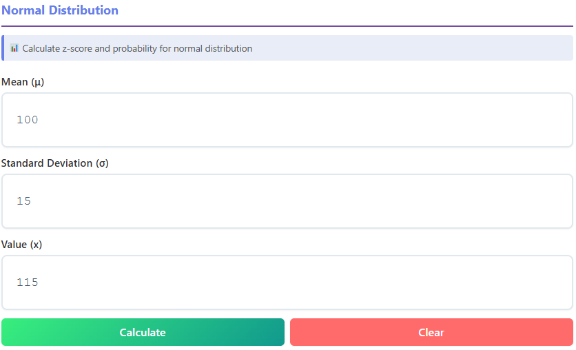
The final tab, "Distribution," is focused on calculations related to the normal distribution, a cornerstone of statistics.
Input Fields:
Here, you'll find input fields for the essential parameters of a normal distribution:
- Mean (μ)
- Standard Deviation (σ)
- Value (x)
Each field is clearly labeled with both its name and its common statistical symbol, which is helpful for students learning the terminology. This attention to detail is something that would also be appreciated in a specialized tool like an ap human geography score calculator, where specific terms and symbols are key. This design makes the AP Statistics Score Calculator an effective learning aid.
Buttons:
The familiar "Calculate" and "Clear" buttons are here, maintaining the consistent user interface across the entire tool. There's no learning curve as you move from one tab to another; the core interactions remain the same.
Results Section:
The results in this tab provide a deep dive into where your 'x' value falls within the distribution. The outputs include:
- Z-Score: The number of standard deviations 'x' is from the mean.
- Cumulative Probability P(X ≤ x): The area under the curve to the left of 'x', presented as a percentage.
- Tail Probability P(X > x): The area under the curve to the right of 'x'.
- Percentile: The percentage of values that fall below your given 'x' value.
The results are presented with clear labels and a mix of numerical values and percentages, making them easy to interpret for academic work or real-world analysis. The AP Statistics Score Calculator excels at making these abstract concepts tangible.
A Closer Look at the Interactive Elements
Beyond the main tabs, the overall user experience of the AP Statistics Score Calculator is polished by several smaller, but equally important, design elements.
The Buttons: More Than Just a Click
The buttons in the AP Statistics Score Calculator are designed for a great user experience.
- Calculate Buttons: These are the primary action buttons and are given visual priority with a strong, appealing color. When you hover your mouse over them, they respond with a subtle visual change, like a slight increase in brightness or a soft shadow appearing underneath. This hover state confirms that the element is interactive. When clicked, there's a quick visual feedback, like a brief change in color, that makes the interaction feel responsive and satisfying.
- Clear Buttons: These secondary buttons are styled to be less prominent, often with a simple outline or a muted gray color. This prevents accidental clicks. When you do click "Clear," the action is instantaneous. All relevant input fields and result sections are wiped clean, providing immediate confirmation that the reset was successful. This functionality is essential for an efficient workflow within the AP A_P_ Statistics Score Calculator.
The Results: Data Presented Beautifully
Getting the right answer is only half the battle; understanding it is just as important. The AP Statistics Score Calculator presents results in a way that is both clear and easy to digest.
- Result Cards and Grids: Instead of a plain text dump, results are organized into grids or individual "cards." This modular layout breaks down complex information into manageable chunks. Each card or grid cell has a clear label and its corresponding value, so you can quickly find the exact metric you're looking for.
- Typography and Color: The font used for the results is clean and highly legible. Key numbers, like the final answer in a probability calculation or the correlation coefficient, are often displayed in a larger font size or a different color to make them stand out. This visual hierarchy guides your attention to the most important information first.
- Data Lists: In the Descriptive Statistics tab, you might also find a sorted list of your data, which is useful for verifying the median and quartiles. These lists are presented neatly, with proper spacing, making them easy to scan. The effective use of an AP Statistics Score Calculator often depends on this clarity.
Extra Features That Enhance the Experience
A great tool is more than just its core functions. The AP Statistics Score Calculator includes several thoughtful features that elevate the overall user experience.
- Responsive Design: The calculator looks and works great on any device. Whether you're on a large desktop monitor, a laptop, or your smartphone, the layout automatically adjusts to fit your screen. Buttons and input fields are easy to tap on mobile, and the text remains readable. This means you can use this powerful AP Statistics Score Calculator anytime, anywhere.
- Smooth Visuals: From the fonts to the spacing between elements, every part of the design feels polished. The fonts are smooth and modern, not pixelated or harsh. The alignment of text, buttons, and input fields is precise, creating a sense of order and professionalism.
- User-Friendly Feedback: The tool provides constant, subtle feedback. Hover effects, button-click animations, and instant result loading all contribute to an interface that feels alive and responsive. You're never left wondering if your click registered or if the calculator is working. This smooth interaction makes using the AP Statistics Score Calculator a genuinely pleasant experience.
The thoughtful design of the AP Statistics Score Calculator ensures that users of all levels can harness its power without a steep learning curve. The clear visual language of the interface allows you to focus on your data, not on figuring out how the tool works. It is truly an exceptional AP Statistics Score Calculator for a wide range of needs. If your work extends beyond statistics, you can also try other internal calculators.
You can also try other internal calculators like ∫ Calculus Calculator for derivatives, integrals, and limits, 📈 Graphing Calculator to plot functions, or 🎲 Probability Calculator for permutations and combinations. The suite of tools provides a consistent, high-quality experience.
In conclusion, this AP Statistics Score Calculator is a masterclass in user-centric design. By prioritizing a clean layout, intuitive controls, and clear visual feedback, it transforms complex statistical calculations into a simple, straightforward process. It stands as a perfect example of how a well-designed AP Statistics Score Calculator can empower users to work more effectively and with greater confidence. The AP Statistics Score Calculator is more than a utility; it's an essential companion for anyone delving into the world of data.
FAQs
What is the AP Statistics Score Calculator, and how can it help me?
The AP Statistics Score Calculator is a user-friendly tool designed to simplify statistical calculations. It helps you analyze datasets, calculate probabilities, perform regression analysis, and explore distributions—all through an intuitive interface. Whether you're a student preparing for exams or a professional working with data, this tool saves time and ensures accuracy.
Can I use the AP Statistics Score Calculator on my phone?
Yes! The AP Statistics Score Calculator is fully responsive and works seamlessly on mobile devices. Its layout adjusts to fit your screen, making it easy to input data, click buttons, and view results, whether you're on a smartphone, tablet, or desktop.
What types of calculations can I perform with this tool?
The AP Statistics Score Calculator offers four main tabs for calculations:
Descriptive Statistics: Analyze datasets for metrics like mean, median, mode, and standard deviation.
Probability: Calculate permutations, combinations, and factorials.
Regression: Perform linear regression to find equations, slopes, and correlations.
Distribution: Explore z-scores, cumulative probabilities, and percentiles for normal distributions.
Each section is designed to make complex calculations simple and visually clear.