Master Your Stock Efficiency: The Ultimate Guide to the Inventory Turnover Calculator
Introduction
Managing a warehouse or retail store often feels like a balancing act. You need enough product on the shelves to satisfy customers, but not so much that your cash is tied up in dusty boxes sitting in the back room. This is where understanding how to calculate inventory turnover becomes critical. It’s the heartbeat of your supply chain—a metric that tells you exactly how fast you are selling through your stock and generating revenue.
For many business owners, the idea of crunching these numbers feels daunting. You might picture complex spreadsheets or confusing accounting software. But tracking your inventory health doesn’t have to be a headache. We have designed a tool specifically to help you analyze these metrics without needing a degree in finance.
This guide will walk you through our Inventory Turnover Calculator. We will explore exactly how the tool looks, how to use its different features, and why it is the simplest way to calculate inventory turnover for your business. Whether you are checking a single product’s performance or comparing different lines, this tool simplifies the process so you can focus on making better business decisions.
Overall Tool Layout & Design
First impressions matter, and when you load up the tool to calculate inventory turnover, you are greeted with a design that prioritizes clarity and focus. We know that business tools can often look drab or cluttered, so we went in the opposite direction.
The entire interface sits on a sleek, purple gradient background. This rich color choice isn’t just aesthetic; it provides a calm, professional backdrop that makes the central calculator card pop. The calculator itself is housed in a clean white container with softly rounded corners and a subtle shadow effect. This creates a sense of depth, lifting the tool off the screen so your eyes are immediately drawn to the workspace.
The layout is modern and responsive. Whether you are sitting at your desktop in the office or checking numbers on your phone while walking through the warehouse, the elements stack and resize perfectly. It’s a professional, business-focused design that removes distractions, leaving you with just the essential fields you need to get the job done.
Title & Information Box
At the very top of the white card, you will see the heading: “📦 Inventory Turnover Calculator.” The box icon adds a nice visual touch, instantly signaling the tool’s purpose. Right below this, a subtitle briefly sets the stage, mentioning how you can track performance and optimize your stock levels.
Just beneath the header, there is a distinct yellow information box. This isn’t just a splash of color; it’s a quick primer. It explains the core purpose of the calculator in plain English. It reminds you that when you calculate inventory turnover, you are essentially measuring how effectively your business converts stock into sales. This little nudge is helpful for beginners who might need a quick refresher before they start punching in numbers.
Tabs Section (Calculation Modes)
Flexibility is key when analyzing business data. Sometimes you need a deep dive into one item, and other times you need to see how products stack up against each other. That’s why the tool features a clear tab navigation system right below the info box.
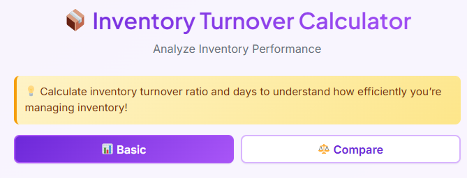
You will see two distinct tabs: Basic and Compare.
The active tab is always highlighted, usually with a darker text or a subtle underline, letting you know exactly which mode you are in. Switching between them is seamless. A simple click or tap instantly changes the input fields below without reloading the page. It gives you immediate visual feedback, so you never get lost. The “Basic” tab is your default starting point, designed for single-product analysis, while the “Compare” tab is ready waiting if you need to benchmark multiple items.
Basic Tab – Input Section
Let’s dive into the “Basic” tab. This is where most users start when they want to calculate inventory turnover for a specific category or SKU. The form is structured vertically, guiding you logically through the data entry process.
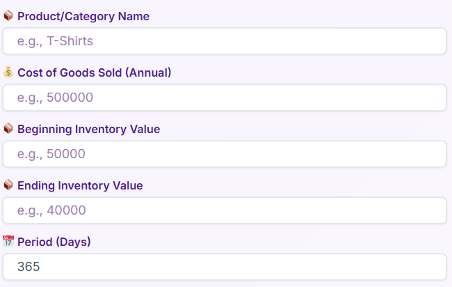
1. Product / Category Name
The first field asks for a name. This is purely for your reference. You might type “Summer T-Shirts” or “SKU-1029.” It helps personalize the results later on.
2. Cost of Goods Sold (Annual)
Next, you enter your Cost of Goods Sold (COGS). The field has a placeholder suggesting a currency value. This is the total cost incurred to produce the goods you sold during the period.
3. Beginning Inventory Value
Here, you input the value of your stock at the start of the time frame you are analyzing. The tool keeps this simple—just a clean text box ready for your number.
4. Ending Inventory Value
Similar to the beginning value, this field asks for the stock value at the end of the period.
5. Period (Days)
Finally, you specify the time frame. Are you looking at a month (30 days) or a full year (365 days)? The input field often defaults to a standard period, but you can easily adjust it.
Throughout this section, placeholder text guides you on what format to use. The design ensures there is plenty of whitespace between fields, so you don’t accidentally tap the wrong one.
Buttons & User Interaction (Basic Tab)
Once your data is in, the interaction is straightforward. The primary call to action is the Calculate Turnover button. It’s styled prominently—typically a bold color that stands out against the white background. When you hover over it with your mouse, you might notice a slight color shift or shadow change, indicating it’s clickable.
Next to it or below, there is a Reset button. This is handy if you want to wipe the slate clean and start over with a new product.
The tool is built for speed. You can often hit the “Enter” key on your keyboard after typing your last number, and it triggers the calculation just like clicking the button.
What happens if you forget a field? The tool is smart. If you try to calculate inventory turnover without entering the Ending Inventory Value, for example, a red error message box appears. It gently alerts you to the missing field, ensuring you don’t get inaccurate results based on incomplete data.
Basic Tab – Results Section
After hitting calculate, the magic happens. The results section expands smoothly below the buttons, presenting a detailed breakdown of your metrics.
First, you see a summary box titled with the Product Name you entered earlier. This makes the data feel personalized.
The core metrics are displayed in individual result cards:
- Inventory Turnover Ratio: This is the big number. It shows how many times you sold and replaced your inventory during the period. Seeing your stock turnover ratio displayed clearly helps you instantly gauge demand.
- Days to Sell Inventory: This metric flips the script, telling you how many days, on average, it takes to clear your stock.
- Efficiency Percentage: A visual indicator of how efficiently capital is being used.
One standout feature is the “Annual Cycles” card. It’s often highlighted to draw attention, as this projects your current performance over a full year.
The interface also includes handy Copy buttons next to these values. With one click, you can copy the result to your clipboard—perfect for pasting into an email or report.
Finally, the tool provides context. You might see a message indicating “Low Turnover” or “High Turnover” based on the numbers. This qualitative feedback helps you understand what does inventory turnover ratio tell you about your business health without needing to consult a textbook.
💳
Payment Terms Calculator
Calculate payment terms and due dates
Compare Tab – Input Section
Sometimes, knowing the stats for one product isn’t enough. You need to know which product is the winner. This is where the Compare tab shines. When you switch to this view, the inputs change slightly to facilitate side-by-side analysis.
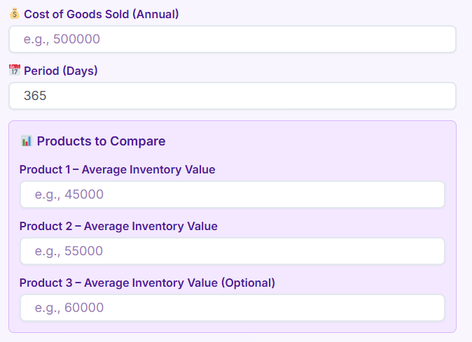
1. Cost of Goods Sold & Period
At the top, you define the baseline. You enter the general COGS and the time period (Days) that applies to the comparison.
2. Product Inputs
Below the general settings, you will see sections for specific products:
- Product 1: Enter the name and Average Inventory.
- Product 2: Enter the name and Average Inventory.
- Product 3 (Optional): A third slot is often available if you need a broader comparison.
This layout is specifically designed for quick benchmarking. By focusing on “Average Inventory,” the tool simplifies the input process, assuming you have already done some basic averaging or want a quick estimate to calculate inventory turnover differences between product lines.
Buttons & User Interaction (Compare Tab)
The user flow here mirrors the Basic tab but is tailored for comparison. The main button reads Compare Products. It is large, clickable, and visually distinct.
A Reset button is also present to clear all product fields at once.
The error handling remains robust. If you fill out Product 1 but leave Product 2 empty, the tool will prompt you to complete the comparison fields. The workflow is clean—you enter the data, hit the button, and the tool processes the logic instantly on the front end. There is no waiting for a page reload; the insights appear immediately.
Compare Tab – Results & Comparison View
The results area in the Compare tab is visually engaging. Instead of a single list, you get a ranked view.
- Ranked Products (🥇🥈🥉): The tool automatically sorts your products. The best performer gets a gold medal icon, the second a silver, and so on. This gamification makes it immediately obvious which item is moving fastest.
- Turnover Ratio per Product: Each product card displays its specific ratio.
- Days to Sell: You can quickly scan to see that Product A takes 20 days to sell while Product B takes 45.
A Best Performer Highlight box often sits at the top or bottom of the list, explicitly stating, “Product A is your most efficient item.”
Finally, a Summary Comparison Box wraps it all up. It naturally mentions the inventory turnover differences, giving you a narrative sentence about how much faster your top product is selling compared to the others. It answers the question of what the comparison reveals about your stock mix.
🎯
Conversion Rate Calculator
Calculate conversion rates for marketing campaigns
Real-Life Examples
To truly understand the power of this tool, let’s look at how people use it in the real world to calculate inventory turnover.
The Boutique Clothing Store
Imagine Sarah, who owns a boutique. She has a rack of winter coats that feels like it’s been full for months. She uses the Basic tab to check the numbers. She enters her costs and inventory levels for the last 90 days. The tool reveals a very low ratio. This confirms her suspicion: the coats are tying up cash. She decides to run a flash sale to free up space for spring arrivals.
The Auto Parts Warehouse
Then there is Mike, a warehouse manager. He is debating whether to order more brake pads or more oil filters. He switches to the Compare tab. He inputs the data for both product lines. The tool ranks the oil filters with a Gold medal, showing they turn over twice as fast as the brake pads. Mike uses this data to adjust his purchasing order, prioritizing the high-velocity oil filters to maximize efficiency.
The Startup Founder
Finally, consider a startup founder preparing for an investor meeting. They need to show that their operations are lean. They use the tool to calculate inventory turnover for their entire fiscal year. They copy the “Annual Cycles” figure directly from the results card into their presentation deck, providing solid proof of their operational efficiency.
Use Cases
This tool isn’t just for one type of person; it serves a wide variety of professionals.
Retail Businesses
For shop owners, shelf space is money. Understanding which items gather dust and which fly out the door is essential. The tool helps them optimize their floor plan and discount strategies.
Ecommerce Sellers
Online sellers often have to pay storage fees for their stock (like in Amazon FBA). A low inventory turnover formula result means they are paying for dead weight. This tool helps them identify slow movers before storage fees eat their profits.
Warehouse Managers
Logistics pros use the tool to plan labor and space. High turnover items need to be placed near the loading docks for easy access. By checking the stats regularly, managers can reorganize the warehouse for speed.
Financial Analysts
Analysts love ratios. They use the tool to assess a company’s liquidity. They know that what does inventory turnover ratio tell you is essentially how liquid the company’s assets are. A healthy ratio suggests a business that manages its cash well.
Small & Large Enterprises
Whether you are a solopreneur running a dropshipping site or a procurement officer at a large enterprise, the need to calculate inventory turnover remains the same. The scale changes, but the principle of efficiency does not.
📈
Growth Rate Calculator
Calculate business growth rate over time
Conclusion
Inventory management doesn’t have to be a guessing game. By using our Inventory Turnover Calculator, you transform raw data into actionable insights. The clean, purple-themed design makes the process pleasant, while the robust features—from the comprehensive Basic tab to the competitive Compare mode—give you the depth of analysis you need.
It’s easy to get bogged down in the daily grind of running a business, but taking a moment to calculate inventory turnover can be the difference between cash flow problems and a healthy, growing operation. This tool removes the friction, the complex math, and the spreadsheets. It gives you clear, visual results that you can use immediately. Bookmark the page, input your numbers, and start making smarter stock decisions today.
FAQs
What is the difference between the ‘Basic’ and ‘Compare’ tabs?
The ‘Basic’ tab is designed for analyzing a single product or category. You use it when you want to calculate inventory turnover for one specific item to see how efficiently it’s selling. The ‘Compare’ tab allows you to see how up to three different products perform against each other. It ranks them so you can quickly identify which items are selling fastest and which are moving more slowly.
Do I need to know the inventory turnover formula to use this calculator?
Not at all. The calculator is designed to do all the math for you. You don’t need to remember the inventory turnover formula. Simply enter the required values like your Cost of Goods Sold and inventory values into the fields, and the tool will instantly calculate the inventory turnover ratio and other key metrics for you.
Where can I find the numbers needed for the input fields?
The data you need, such as Cost of Goods Sold (COGS) and inventory values, can typically be found in your business’s accounting software, inventory management system, or financial statements like the balance sheet and income statement. If you are unsure, your bookkeeper or accountant can help you locate these figures.