Enter Your Reading
Your Blood Pressure Category
—
How to Calculate MAP Blood Pressure
As a medical practitioner with decades of experience, I’ve had countless conversations with patients about their blood pressure. It’s a number, or rather two numbers, that we’re all taught to watch. But beyond just knowing your systolic and diastolic readings, there is a deeper layer of understanding that can empower you to take better control of your cardiovascular health.
This deeper understanding often begins with a question I hear frequently: “What is my mean arterial pressure?” Today, we’re going to explore that very question, not with complex medical formulas, but by looking at a simple, intuitive tool designed to help you see your blood pressure in a new light. This guide will walk you through understanding this powerful metric and show you how to calculate MAP blood pressure without any of the intimidating math.
Unlocking a Deeper View of Your Heart Health

Right at the top of the page, you’ll see a beautifully designed hero card. It has a welcoming purple gradient that feels calming, not clinical. Emblazoned on it is the title “❤️ Blood Pressure Calculator,” accompanied by a clear and simple subtitle: “Track and understand blood pressure readings.” This isn’t just a simple input-output machine; it’s a dashboard for your health.
Many people turn to tools like this because they want more than just numbers; they want meaning. They’ve been told by their doctors to monitor their blood pressure, but they feel a disconnect between the readings on their cuff and what it actually means for their body. This is precisely why understanding how to calculate MAP blood pressure is so valuable.
So, what exactly is Mean Arterial Pressure, or MAP? In the simplest terms, MAP is the average pressure in your arteries during one complete heartbeat cycle. Think of it like this: your blood pressure isn’t static. It rises with each heartbeat (systolic pressure) and falls as the heart rests between beats (diastolic pressure).
MAP provides a single, comprehensive number that reflects the overall pressure driving blood flow to your vital organs—your brain, kidneys, and liver. It’s a measure of perfusion, which is just a medical term for how well your blood is nourishing your body’s tissues.
Why does this matter? For clinicians, MAP is a critical indicator. A stable MAP suggests that your organs are receiving a steady, adequate supply of oxygenated blood. If it’s too low, it could mean insufficient blood flow, leading to dizziness or even organ damage over time. If it’s consistently too high, it signals that your heart is working overtime and your arteries are under constant strain, a hallmark of hypertension.
This is where a tool that simplifies how to calculate MAP blood pressure becomes indispensable for at-home monitoring. It provides a more holistic view than just looking at systolic and diastolic numbers in isolation, offering crucial insights for long-term hypertension management and overall cardiovascular wellness. Learning how to calculate MAP blood pressure is a significant step toward proactive health management.
Entering Your Numbers: The First Step to Insight
Just below the main banner, you’ll find the interactive heart of the calculator: the “Enter Your Reading” card. This section is designed to be straightforward and mistake-proof. It invites you to input the two numbers you get from your blood pressure cuff, and it’s here that the journey to understanding your MAP begins.
The Systolic Input: Your Heart’s Push

The first field you’ll see is labeled “Systolic (Top number).” This clarity is intentional. Many patients get confused about which number is which, so the tool explicitly guides you. To the right of the label, a live value preview shows a default of “120,” giving you an immediate example of what to enter. The input field itself is a clean, white, rounded box, making it feel modern and approachable. Beside the input field, the unit “mmHg” (millimeters of mercury) is clearly displayed, so there’s no guesswork about the measurement.
The systolic number represents the pressure your blood exerts against your artery walls when your heart beats. It’s the peak pressure, the moment of maximum force. When you change this number in the tool, you’re telling it how hard your heart is working to pump blood. As you might expect, a higher systolic reading will generally contribute to a higher MAP. This input is a key piece of the puzzle when you’re learning how to calculate MAP blood pressure. Getting this number right is the first step in any accurate map calculation. It sets the stage for a complete picture of your heart’s performance.
The Diastolic Input: Your Heart’s Rest
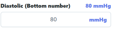
Directly below the systolic field is the “Diastolic (Bottom number)” input. It shares the same user-friendly design: a clear label, a live value preview (defaulting to “80”), a matching white input field, and the “mmHg” suffix. This consistency makes the tool incredibly easy to navigate. The diastolic number represents the pressure in your arteries when your heart is at rest between beats. It’s the lowest pressure your arteries experience during the cardiac cycle.
Interestingly, from a clinical perspective, the diastolic value often carries significant weight when determining MAP. While both numbers are essential, the diastolic pressure is present for a longer portion of the cardiac cycle than the peak systolic pressure. Therefore, it has a substantial influence on the overall average pressure. This is a crucial point for anyone asking how do you figure out map—your resting pressure is a powerful predictor of the constant force on your artery walls. When using this tool, you’ll notice that adjustments to the diastolic number have a very direct and visible impact on the final analysis.
Patients commonly make mistakes here, sometimes swapping the two numbers or entering readings from days ago. It is vital to use your most recent reading for an accurate assessment. This section simplifies the first, most critical action in discovering how to calculate MAP blood pressure, making the process of getting an accurate mean bp accessible to everyone. The tool demystifies the process, turning what could be a confusing task into a simple, two-step action. For anyone seeking to learn how to calculate map, this clear and guided input process is the perfect starting point.
Bringing Your Numbers to Life: Analyze, Reset, Print
Once you’ve entered your systolic and diastolic readings, the next section presents you with three distinct buttons: “Analyze,” “Reset,” and “Print.” Each button serves a specific, practical purpose, transforming your raw data into actionable information. This is where the tool moves from data entry to genuine insight, helping you understand the story behind your numbers.
The most important button here is the prominent, blue “Analyze” button. The moment you click it, the calculator processes your inputs and instantly updates the entire dashboard. The output card will display your blood pressure category, the MAP visualization chart will pinpoint your reading, and the advice text will offer personalized guidance. This single click is the gateway to understanding your cardiovascular status.
It doesn’t just perform a calculation; it provides a comprehensive interpretation. For someone monitoring their health, this function is the core of why they came here to learn how to calculate MAP blood pressure. It connects their reading to a meaningful outcome.
Next to it is the “Reset” button. Its function is simple but essential: it returns both the systolic and diastolic input fields to their default values (120 and 80, respectively). This is incredibly useful for several reasons. Perhaps you made a mistake entering your numbers, or maybe you want to quickly compare your reading to a normal baseline.
A quick click on “Reset” clears the slate, allowing you to start fresh without having to manually delete your previous entries. It’s a small feature that adds a layer of convenience, ensuring the tool remains easy and efficient to use, especially when you’re exploring how different numbers affect the outcome.
Finally, there’s the “Print” button. This feature is one I particularly appreciate as a clinician because it bridges the gap between at-home monitoring and professional medical care. Clicking this button prepares a clean, simple report of your blood pressure readings, category, and MAP-related interpretation that you can print out. I often have patients like John, a 65-year-old man recently diagnosed with hypertension, who diligently tracks his readings at home.
John used to bring me a handwritten log, which was sometimes hard to read. Now, he brings a printed sheet from this calculator. It’s clear, concise, and shows me not only his numbers but also that he is engaging with his health on a deeper level. This printed report becomes a valuable document for his medical file and a fantastic starting point for our conversations about his treatment plan and the importance of understanding how to calculate MAP blood pressure.
Your Results at a Glance: The Blood Pressure Category
After you click “Analyze,” your attention is immediately drawn to the “Your Blood Pressure Category” output card. This section translates your numbers into a universally understood health classification, providing immediate context for your reading. The heading is large and unambiguous, leaving no room for confusion. Below it, your category is displayed in bold text. You’ll see one of several possibilities: “Normal,” “Elevated,” “Hypertension Stage 1,” “Hypertension Stage 2,” a dangerous “Hypertensive Crisis,” or on the other end, “Hypotension.”
Accompanying the text is a powerful visual cue: a colored pill-shaped indicator. This simple design element communicates the severity of your reading instantly. Green signifies a “Normal” reading, giving you a sense of reassurance. Yellow appears for “Elevated,” serving as a gentle warning to pay closer attention.
Orange for “Stage 1” and a more intense red for “Stage 2” indicate increasing levels of concern. In the event of a “Hypertensive Crisis,” the indicator becomes a stark, blinking black and red, visually screaming that you need immediate medical attention. For hypotension, a calm blue is used. This color-coding system is incredibly effective because it taps into our universal understanding of traffic light colors, making the information accessible even before you read the words.
This immediate feedback is vital for anyone trying to understand how to calculate MAP blood pressure in a meaningful way. A number is just a number, but a category gives it significance. For example, a patient named Maria, who monitors her blood pressure daily, finds this feature invaluable. Seeing the green “Normal” pill gives her peace of mind that her lifestyle changes are working. On days when it creeps into the yellow “Elevated” zone, it’s a direct prompt for her to evaluate her diet and stress levels for that day.
Below the category, the tool provides a patient-friendly recommendation, such as “Your blood pressure is in the normal range. Maintain a healthy lifestyle.” or “Your blood pressure is high. We recommend consulting a healthcare provider.” This output transforms the abstract concept of how to calculate MAP blood pressure into a practical, personal health guide. It helps users not just see their data, but also understand what to do next. The process of learning how to calculate MAP blood pressure is made simpler with these clear visual aids.
This tool is a great companion for anyone focusing on their overall wellness. Managing blood pressure is just one part of the equation. Ensuring you get enough protein to maintain muscle mass, which is good for your metabolism and overall strength, is also key. A tool like this can help.
💊
Protein Calculator
Calculate daily protein requirements
Seeing Your Pressure: The MAP Visualization Chart
Perhaps the most innovative feature of this calculator is the MAP visualization chart. It sits prominently on the dashboard, and after you analyze your readings, it truly comes to life. This isn’t just a static graph; it’s a dynamic representation of your cardiovascular health. The chart is laid out on a grid with a five-column dashed background, creating zones that correspond to the different blood pressure categories, from normal to crisis. This visual zoning helps you instantly see where your reading falls within the broader spectrum of health.
The star of the show is a single purple dot—your MAP point. When you enter your systolic and diastolic numbers and click “Analyze,” this purple point moves to a specific location on the grid. This is where the magic happens. The chart elegantly translates your two separate blood pressure numbers into one unified position. The dot’s horizontal position on the chart is determined by your systolic pressure, while its vertical position is determined by your diastolic pressure. You can literally watch the dot shift left or right as you adjust the systolic input and move up or down as you change the diastolic input.
This visualization is a game-changer for patients. It provides an intuitive, visual answer to how your two readings combine to create a single point of pressure. You can see how a high systolic and a high diastolic reading push the dot into the upper-right corner—the red zone of hypertension. Conversely, healthy numbers place the dot comfortably in the lower-left green zone. This visual feedback is incredibly powerful for understanding concepts like mean bp and the overall strain on your cardiovascular system without ever needing to see a formula. It makes the map calculation feel tangible.
For anyone who has ever wondered how to calculate MAP blood pressure, this chart provides the most intuitive answer possible: you don’t calculate it, you see it. This visual demonstration is often more impactful than any numerical explanation of how to calculate MAP blood pressure could ever be. It reinforces why clinicians are interested in the complete picture, not just one number. Seeing that purple dot move empowers you to understand how lifestyle choices can guide it toward a healthier zone.
Physical activity is another cornerstone of cardiovascular health. Tracking your strength progression can be a great motivator. For those who lift weights, understanding your one-rep max is crucial for safe and effective training.
🏋️
1RM Calculator
Calculate your one-rep max for weightlifting
Open Calculator →
Reading the Axes: The Chart Labels
To make the MAP visualization chart fully understandable, it is framed by two clear labels, or axes. These labels are the keys to interpreting the position of your purple MAP point. At the bottom of the chart, you’ll see a horizontal scale labeled “Systolic →.” This axis represents your systolic pressure, with numbers increasing from left to right. On the far left, you have lower systolic values, and as you move to the right, the values climb, corresponding to the increasing pressure when your heart contracts.
Running up the left side of the chart is the other axis, labeled “Diastolic →,” cleverly rotated 90 degrees to run vertically. This scale represents your diastolic pressure, with numbers increasing from bottom to top. The bottom of the chart corresponds to lower diastolic values (the pressure when your heart rests), and as you move upward, the values increase.
Together, these two axes create the grid on which your blood pressure is plotted. When you get a reading from your cuff, say 125/85 mmHg, you can visually find your spot on the chart. You would trace your finger across the bottom axis to 125 and then move it upward until it aligns with 85 on the vertical axis. The purple dot on the calculator does this for you automatically, landing precisely at the intersection of your two values. This visual cross-referencing is an incredibly intuitive way for patients to compare their readings.
It helps them understand why a reading of 140/80 and 130/90 might fall into the same risk category, even though the numbers are different. It’s a practical lesson in how systolic and diastolic pressures interact. This feature directly addresses the question of how do you figure out map by showing the relationship visually. Instead of just seeing two numbers, you see a single, meaningful position. This graphical representation provides a much richer understanding than a simple numerical output and is a cornerstone of how to calculate MAP blood pressure in a modern, user-friendly way. It supports a real-world comprehension of blood pressure dynamics, making the entire concept less abstract and more personal.
And of course, quality sleep is fundamental to recovery and blood pressure regulation. Getting the right amount of sleep can have a profound impact on your daytime readings and overall well-being.
😴
Sleep Calculator
Find optimal bedtime and wake-up times
Open Calculator →
Your Personalized Path Forward: The Advice Text
The final piece of this comprehensive tool is the recommendation section, which provides dynamic advice text. Located just below the main outputs, this paragraph of text changes based on the blood pressure category your reading falls into. It’s the part of the tool that answers the silent question every patient has after seeing their results: “So what do I do now?” This section is crafted to be supportive and actionable, not alarming. It closes the loop, connecting your data to practical, real-world guidance.
For instance, if your reading is in the “Normal” range, the advice might be encouraging: “Great job! Your blood pressure is within a healthy range. Continue to maintain a balanced diet, regular physical activity, and healthy habits to support your cardiovascular health.” This positive reinforcement is crucial for motivating continued healthy behavior. If your reading falls into the “Elevated” or “Hypertension Stage 1” category, the tone shifts slightly to be more cautionary but still empowering. It might suggest: “Your blood pressure is higher than normal.
We recommend discussing these readings with your healthcare provider. Lifestyle changes such as reducing sodium intake, increasing physical activity, and managing stress can have a significant impact.”
For readings in the “Hypertensive Crisis” zone, the advice is direct and urgent, instructing you to seek immediate medical care. This dynamic content is critical because it contextualizes the numbers. As clinicians, we give similar advice in person, but having it reinforced by a tool at home can be incredibly powerful. We consider MAP when framing our recommendations because it gives us a better sense of the sustained pressure on the organs. A consistently high MAP, even with seemingly moderate numbers, signals a greater long-term risk, which might prompt us to suggest more assertive lifestyle changes or medication.
This advice section is often what people are truly seeking when they search for how to calculate MAP blood pressure. They don’t just want a number; they want to know what that number means for their life and what they can do about it. The calculator delivers precisely that. It translates a clinical metric into personal advice, empowering users to take the next step, whether that’s celebrating a good result, making a lifestyle adjustment, or scheduling a visit with their doctor.
This tool is a perfect example of how technology can help us all better understand and manage our health. The ability to easily learn how to calculate MAP blood pressure is a significant advancement in patient education. Ultimately, knowledge is power, and knowing how to calculate MAP blood pressure puts more of that power directly into your hands.
FAQs
What is MAP (Mean Arterial Pressure), and why is it important?
MAP, or Mean Arterial Pressure, is the average pressure in your arteries during one complete heartbeat cycle. It’s a critical measure because it reflects how well blood is flowing to your vital organs, such as the brain, kidneys, and heart. A healthy MAP ensures that your organs are receiving enough oxygen and nutrients. Clinicians often use MAP to monitor conditions like hypertension, organ perfusion, and overall cardiovascular health.
How do systolic and diastolic blood pressure affect MAP?
Systolic pressure (the top number) represents the force of blood against artery walls when the heart beats, while diastolic pressure (the bottom number) reflects the pressure when the heart rests between beats. Both numbers contribute to MAP, but diastolic pressure has a slightly greater influence because the heart spends more time in the resting phase. Understanding these numbers helps you see how MAP is calculated and why it’s a more comprehensive measure of blood pressure.