Master the Growth Rate Calculator
Introduction
In the fast-moving landscape of business and finance, understanding your trajectory is everything. Whether you are tracking a startup’s monthly revenue, monitoring the subscriber count of a new YouTube channel, or simply trying to gauge how your personal savings are performing, the ability to see clear, actionable data is paramount. This is where our Growth Rate Calculator comes into play. It is designed to be a visual powerhouse, stripping away the complexity of spreadsheets and replacing them with a sleek, interactive interface that makes the process of calculating the growth rate intuitive and accessible for everyone.
This tool is not just a static form; it is a dynamic dashboard that responds to your inputs in real-time. It eliminates the friction often associated with financial analysis by presenting a clean, user-friendly environment. Instead of staring at blank cells, you are greeted by a structured, guided experience.
In this guide, we will take a deep dive into exactly what you see on your screen when using this tool. We will explore every button, field, tab, and chart. Our goal is to ensure that when you are ready to begin calculating the growth rate, you know exactly where to click, what to enter, and how to interpret the beautiful data visualizations the tool generates for you.
The Visual Landscape: A Tour of the Interface
Before we start clicking buttons, let’s orient ourselves with the general design. The first thing you will notice is the modern, professional aesthetic. The tool is housed within a vibrant purple gradient outer container. This isn’t just for show; the high-contrast background focuses your eye directly on the main workspace: a crisp, white rounded card floating in the center of the screen.
The white card features a subtle shadow, giving it a sense of depth and separation from the background. At the very top of this card, you will see the tool’s title centered perfectly, accompanied by a representative icon that signifies upward trends. Directly beneath the main title is a short, descriptive subtitle. This text helps confirm you are in the right place for calculating the growth rate effectively.
The design is fully responsive. If you are accessing this from a desktop, you have plenty of breathing room. If you are on a tablet or mobile device, the white card resizes intelligently, ensuring that inputs and buttons remain finger-friendly and legible without you needing to pinch or zoom.
Navigating the Tabs
The core functionality of the tool is organized into three distinct tabs located near the top of the white card. These tabs allow you to switch between different modes of analysis depending on your specific needs. The tabs are labeled:
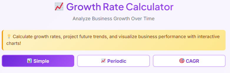
- Simple
- Periodic
- CAGR
Switching Modes
When you first load the page, the “Simple” tab is active by default. You can tell which tab is active because of the visual state change. The active tab is highlighted—often with a distinct background color or a bold underline—while the inactive tabs remain more subtle. Clicking on a different tab instantly swaps out the content below it.
The transition is seamless. There is no page reload; the interface simply updates to show the relevant fields for that specific mode. This tabbed design is crucial because calculating the growth rate requires different inputs depending on whether you are looking at a simple jump between two numbers or a complex multi-year trend.
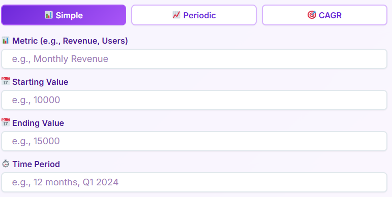
The Simple Tab: Instant Analysis
The “Simple” tab is your go-to for quick, one-off comparisons. It is perfect for when you just need to know the difference between point A and point B without any fluff.
Input Fields
On the front end, this section presents you with a clean vertical layout of input fields.
- Metric Name: This is a text field where you can label what you are measuring (e.g., “Revenue,” “Twitter Followers”). It helps personalize the report later.
- Starting Value: Here, you enter your initial number. The field is formatted to accept numeric values.
- Ending Value: This field captures where you ended up.
- Time Period: This is a flexible text input. You can type “Q3,” “2023,” or “May” to give context to the duration.
Interaction and Buttons
Once your data is entered, your eyes are drawn to the primary action button labeled “Calculate Growth.” It is usually styled in a bold color to stand out against the white background. When you click this, the tool processes your inputs. Next to it, there is a “Reset” button, typically styled more subtly (perhaps as an outline button or ghost button), which clears all fields instantly so you can start over.
The Results Display
After clicking calculate, the results section appears below the buttons. You aren’t just given a number; you are given a dashboard.
- Summary Box: A highlighted box grabs your attention first, showing the primary percentage change.
- Result Cards Grid: Below the summary, a grid of cards breaks down the details. You will see cards for “Starting Value,” “Ending Value,” “Absolute Growth” (the numeric difference), and “Multiplier.”
- Insight Messages: Perhaps the most useful visual feature is the insight message. Depending on your result, a colored banner appears. It might say “Excellent” in green if the numbers are high, or “Decline” in red if the ending value is lower than the start. This gives you immediate qualitative feedback on the quantitative data.
The Periodic Tab: Tracking Trends Over Time
While the Simple tab is great for snapshots, the “Periodic” tab is the powerhouse for trends. This interface is slightly more complex, designed for users who have a series of data points.
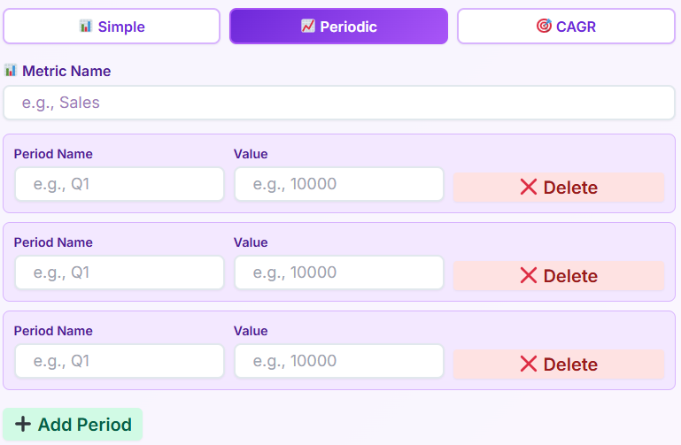
Dynamic Rows
The most distinct feature of the Periodic tab is the dynamic input section. Initially, you might see just a couple of rows.
- Period Rows: Each row consists of two fields: “Period Name” (e.g., Jan, Feb, Mar) and “Value.”
- Add Period Button: Below the rows, there is a prominent “Add Period” button. Clicking this instantly appends a new blank row to your list, allowing you to enter as many data points as you need.
- Delete Buttons: To the right of each row, there is a small trash icon or “X” button. This allows you to remove a specific period if you made a mistake, giving you full control over the data set.
Analyzing the Data
Once you have populated your rows, you click the “Analyze Growth” button. This triggers the generation of a comprehensive report section that slides into view. This is essential for calculating the growth rate across multiple intervals, rather than just start-to-finish.
Visual Outputs: Charts and Tables
The Periodic tab results are visually rich:
- Growth Trend Line Chart: You will see a line graph plotting your values over time. The line connects your data points, offering a clear visual representation of ups and downs. The axes are automatically labeled based on your inputs.
- Growth Rate Bar Chart: Often accompanying the line chart is a bar chart that visualizes the percentage change period-over-period. Green bars might indicate positive change, while red bars extending downwards indicate negative change.
- Comparison Table: For those who prefer reading data, a structured table appears. It lists every period side-by-side with columns for “Value,” “Growth %,” and “Absolute Growth.” This allows you to scan down the list and pinpoint exactly when a spike or drop occurred.
The CAGR Tab: Long-Term Vision
The third tab is dedicated to Compound Annual Growth Rate (CAGR). This interface is streamlined for long-term forecasting and retrospective analysis.
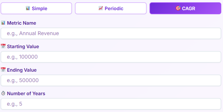
Specialized Inputs
The fields here are specific to time-based compounding.
- Number of Years: Unlike the other tabs, this numeric input is crucial here. The interface clearly labels it, ensuring you know this calculation is time-dependent.
- Start and End Values: Similar to the Simple tab, but the context here is strictly the beginning and end of a multi-year span.
The Forecast View
When you hit calculate in this tab, the results focus on the “smooth” growth rate.
- Result Cards: You see cards for the CAGR percentage and the Total Growth percentage.
- Projection Messages: The insight section here is tailored to long-term viability. You might see messages like “Exceptional” or “Strong,” color-coded to indicate the health of the investment or metric over the long haul.
- Visualizing the Smooth Line: The chart generated here typically compares your actual growth (if data points were provided) versus the “theoretical” smooth growth line of the CAGR, helping you visualize the average consistency of your growth. This makes calculating the growth rate for long-term investments much easier to digest visually.
Deep Dive into Charts & Visuals
The visual component of this tool cannot be overstated. We aren’t just talking about raw text; we are talking about interactive charts.
Line Chart Behavior
The line charts used in the tool are interactive. When you hover your mouse pointer over a specific point on the line, a tooltip usually pops up. This small floating box displays the exact value and period name for that specific dot. This interactivity allows you to explore the data without cluttering the screen with numbers. The line itself is usually drawn in a bold, contrasting color (like blue or purple) to stand out against the chart’s grid lines.
Bar Chart Comparison
In the Periodic tab, the bar charts are particularly effective for spotting volatility. The zero-line is clearly marked. Bars rising above it represent growth; bars dropping below represent contraction. This visual dichotomy allows you to assess the stability of your metric in seconds. You don’t need to read the percentages to know if you had a bad month; the red bar tells you instantly.
Responsiveness of Visuals
One of the best front-end features is how these charts behave on mobile. On a smaller screen, the charts rescale. The labels on the axes might rotate or abbreviate to fit the narrower width, ensuring that the visualization remains legible. This attention to detail ensures that calculating the growth rate on a phone is just as insightful as doing it on a desktop monitor.
Export Options: Sharing Your Insights
You have done the work, entered the data, and analyzed the charts. Now, you need to share it. The tool includes a dedicated export section that appears only after you have generated results.
Download PDF
There is a “Download PDF” button, typically accompanied by a download icon. When you click this, the front-end triggers a generation process that captures your current view—charts, tables, and summary cards—and compiles them into a neat, downloadable document. This is perfect for attaching to emails or saving to your digital records.
Print Functionality
Next to the download option is a “Print” button. Clicking this opens your browser’s native print dialog. However, the tool is often styled with a “print stylesheet.” This means when you print, the purple background and unnecessary navigation elements are stripped away, leaving you with a clean, ink-friendly version of your report.
These export options transform the tool from a simple calculator into a reporting engine. You aren’t just calculating the growth rate; you are creating professional documentation of it.
Real-Life Use Cases
Who actually uses this interface, and for what? The versatility of the front-end design makes it suitable for various scenarios.
Business Revenue Tracking
Imagine a small business owner. They open the Periodic tab at the end of every quarter. They input their revenue figures for Jan, Feb, and Mar. By visualizing the trend lines, they can instantly see if their marketing efforts in February paid off. The tool turns abstract bank account numbers into a visual story of success or stagnation.
Price Increase Analysis
A freelance consultant might use the Simple tab as a price increase calculator to determine how to adjust their rates. By entering their current rate as the starting value and their desired rate as the ending value, they can see the exact percentage jump. Seeing a “15% increase” on the screen helps them justify the change to clients, rather than just guessing a new number.
User Growth Monitoring
A startup founder monitoring their app’s user base can use the tool to see week-over-week traction. They might ask how to calculate increase in daily active users. By plugging the numbers into the Simple tab, they get an instant percentage. If they want to see the trajectory over a month, they switch to the Periodic tab. The tool adapts to their changing need for granularity.
Who This Tool Is For
The user-centric design ensures that this calculator appeals to a broad audience.
- Business Owners: They appreciate the “Insight Messages” that tell them if their growth is healthy without needing a finance degree.
- Financial Analysts: They value the CAGR tab and the precision of the inputs when calculating the growth rate for client portfolios.
- Marketers: The export features allow them to quickly grab charts for slide decks to prove campaign ROI.
- Startup Founders: The speed of the “Simple” tab is perfect for the fast-paced nature of startup life where quick metrics are needed for pitch decks.
- Students: The clean breakdown of “Absolute Growth” vs. “Percentage Growth” helps them visualize concepts they are learning in class regarding how to compute for growth rate problems.
- Managers: They use the PDF export to append data to their weekly status reports.
Related Financial & Business Tools
To assist you further with your business metrics, we have integrated links to other helpful tools within our ecosystem. You can find these related resources generally located at the bottom of the page or in a sidebar.
- Hourly Rate Calculator: If you are looking to translate your annual salary goals into a billable hour, this tool is the perfect companion.
- Business Valuation Calculator: Once you are done calculating the growth rate of your revenue, use this tool to estimate what your business might be worth to investors.
- Depreciation Calculator: While growth tracks upward trends, this tool helps you calculate asset depreciation over time, managing the other side of your balance sheet.
The Simplicity of Complex Math
The beauty of this tool lies in what it hides. It hides the complexity. It hides the formulas. It hides the tedious nature of manual math. When you are looking for how to calculate percentage growth, you don’t want a math lesson; you want an answer.
The interface is designed to facilitate that answer. Every element, from the layout of the input fields to the color of the result buttons, is placed with intention. The “Simple” tab handles the everyday questions. The “Periodic” tab handles the storytelling of data over time. The “CAGR” tab handles the long-term vision.
By providing immediate visual feedback through charts and color-coded insights, the tool bridges the gap between raw data and understanding. You don’t need to wonder if a specific percentage is “good” or “bad”—the interface gives you a hint. You don’t need to wonder if the trend is choppy or smooth—the line chart draws it for you.
Why Visuals Matter
When calculating the growth rate manually, it is easy to make a keystroke error. A misplaced decimal point can ruin an analysis. This front-end interface minimizes that risk. The fields are clearly labeled. The error messages (which appear in red text if you miss a field) guide you to fix mistakes before they happen.
Furthermore, the visual nature of the results aids in retention. Seeing a steep green line going up is more memorable than seeing the number “12%” on a piece of paper. The interface transforms the chore of calculation into an experience of discovery.
Conclusion
In summary, this Growth Rate Calculator is a masterclass in user-focused design. It takes the potentially dry task of calculating the growth rate and turns it into an engaging, visual process. The distinct tabs—Simple, Periodic, and CAGR—ensure that whether you are checking a quick stat or analyzing a five-year plan, you have the right interface for the job.
The inclusion of interactive charts, clear summary cards, and robust export options means that this tool serves you from the moment of data entry to the final presentation of your report. It saves time by automating the visualization of data. It saves mental energy by providing insight messages that interpret the numbers for you.
Whether you are figuring out how to compute for growth rate for a school project, acting as a price increase calculator for your services, or determining how to calculate percentage growth for your stock portfolio, this tool’s front-end experience is designed to support you. It is accurate, it is fast, and most importantly, it is easy to use. By focusing purely on what you see and interact with, we have ensured that the path from raw number to actionable insight is as short and smooth as possible. When you next find yourself needing to track performance, remember that calculating the growth rate doesn’t have to be a headache—it can be just a few clicks away.
Maximizing Your Workflow
To get the most out of the tool, familiarize yourself with the layout. Remember that the “Reset” button is your friend if you want to clear the deck and start fresh. Use the “Metric Name” field to keep your exports organized—it’s a small detail on the screen, but it makes your PDF reports look much more professional.
When you are calculating the growth rate for multiple different projects, utilize the browser’s ability to keep multiple tabs of the tool open. Since the tool is front-end based, it is lightweight and won’t slow down your machine. You can have one tab open for Revenue, another for User Count, and a third for Expenses, toggling between them to get a holistic view of your business health.
Understanding the “Why” Through the “What”
Ultimately, this tool’s interface helps you answer the “Why.” Why did revenue spike in March? Look at the Periodic tab’s bar chart. Why is the annual return lower than expected? Check the CAGR result cards. The interface empowers you to ask these questions by presenting the data clearly.
You no longer need to search for a percentage increase formula or struggle with a calculator app. The tool presents the fields, you fill them in, and the logic happens instantly behind the scenes, updating the UI in milliseconds.
Final Thoughts on the User Experience
The purple gradient is more than just a color choice; it sets a tone of modern sophistication. The white card is a clean slate for your data. The interactive charts are your analytical partners. Every aspect of the front-end has been crafted to make calculating the growth rate a seamless part of your day.
From the first click to the final PDF download, the journey is linear and logical. There are no hidden menus, no confusing settings, and no clutter. Just you, your numbers, and a clear path to understanding your growth. So, go ahead and start calculating the growth rate today—the insights are waiting for you right there on the screen.
A Note on Responsiveness
We briefly touched on mobile use, but it is worth reiterating. In a world where decisions are made on the go, the ability to pull up this tool on a smartphone and flawlessy execute a calculation is vital. The buttons are sized for touch. The text scales for readability. You can be in a meeting, pull out your phone, and start calculating the growth rate of a proposed strategy in seconds, showing the result to your colleagues right on your device.
This flexibility is the hallmark of modern web tools. It doesn’t tether you to a desk. It moves with you. Whether you are calculating the growth rate at a coffee shop, in a boardroom, or at your home office, the experience remains consistent, beautiful, and functional.
The Educational Value
For those learning how to calculate increase in a business context, the interface serves as a tutor. By separating “Start Value” and “End Value” so clearly, it reinforces the components of growth. By displaying “Absolute Growth” next to “Growth %,” it visually distinguishes between the magnitude of the change and the rate of the change. This subtle educational reinforcement happens simply by interacting with the UI.
You are not just using a tool; you are reinforcing your understanding of the metrics. Every time you are calculating the growth rate, you are seeing the relationship between the inputs and the visual outputs, solidifying your grasp on the data.
Streamlining Decisions
Every feature we have discussed—from the “Simple” tab inputs to the “Periodic” tab charts—converges on one goal: better decision making. When the barrier to calculating the growth rate is removed, you do it more often. When you do it more often, you are more informed.
The interface removes the barrier. It invites you to plug in numbers and play with scenarios. What if sales go up by 500? What if they drop by 200? The “Calculate” button is always there, ready to update the visuals instantly. This interactivity encourages exploration.
So, rely on the clean lines of the line chart. Trust the green and red banners of the insight messages. Use the PDF export to back up your arguments. This tool is your front-end companion for all things growth. Start calculating the growth rate now and see your data in a whole new light.
Precision in Design
Notice the padding around the input fields? The space between the rows in the comparison table? These design choices prevent visual fatigue. When you are calculating the growth rate for twenty different periods, a cramped interface would be exhausting. Here, the generous white space keeps the experience airy and manageable.
The font choice is also deliberate—clean sans-serif typefaces ensure that numbers are easily readable, preventing the confusion of a ‘1’ looking like an ‘l’. Precision in design leads to precision in analysis.
Summary of Growth Rate Calculator
We have toured the purple background, the white card, the three powerful tabs, and the dynamic charts. We have seen how the tool assists everyone from students to CEOs. We have looked at how to export your findings. The only thing left is for you to use it. When the need arises for calculating the growth rate, you now know exactly what to expect from this interface. It is ready to turn your inputs into insights.
Whether you are calculating the growth rate for a single month or a decade, the tool scales with you. It is the ultimate front-end solution for visualizing progress. Thank you for choosing this guide to navigate your growth journey. Keep calculating the growth rate, keep analyzing, and keep growing.
FAQs Calculating the growth rate
What is the difference between the ‘Simple’, ‘Periodic’, and ‘CAGR’ tabs?
Each tab is designed for a specific type of growth calculation to give you the most relevant insights.
Simple: Use this tab for a quick, one-time calculation between two points. It’s perfect when you just need to find the growth rate between a single starting value and a single ending value.
Periodic: Select this tab when you have multiple data points over a series of periods (e.g., monthly sales figures). It allows you to track trends, see period-over-period changes, and visualize the data in charts.
CAGR (Compound Annual Growth Rate): This tab is specifically for calculating the smoothed-out annual growth rate over a multi-year period. It is ideal for long-term investment analysis and business forecasting.
Can I save or share my results?
Yes, you can easily export your results for reports, presentations, or personal records. After you generate a calculation on any of the tabs, an export section will appear below your results. You will see two options:
Download PDF: This creates a professional-looking PDF document containing your summary, result cards, and any charts you generated.
Print: This option opens your browser’s print dialog, allowing you to print a clean, formatted version of your report.
How do I analyze growth over multiple periods like months or quarters?
The ‘Periodic’ tab is built for this exact purpose.
Click on the Periodic tab.
For each time period you want to analyze, enter a name (e.g., “January” or “Q1”) and its corresponding value.
If you need to add more time periods, simply click the Add Period button to create a new row.
Once you have entered all your data points, click the Analyze Growth button. The tool will then display a line chart to show the trend, a bar chart comparing the growth between each period, and a detailed table with the specific numbers.